2021 Week 35 | Power BI: Infographics | My Attempt
Data Scrapping
As stated in the notes Data scrapping is the most challenging part of this weeks challenge. 2 data sources given in the challenge. I created excel table with scrapped data from coffee affection website and imported it to the Power Query Editor with given Excel table.
Step 1 - First Draft
Before I jump into Pure viz custom visual as instructed in the challenge I thought I should figure out how this should be done with classic visuals. This is the first draft I created using 5 card visuals and slicer.
I wanted to get the colors and order correct. So I created draft with already available visuals. In the middle there are 4 card visuals, each has ingredient color set as background and ingredient name as card value. Ingredient 1 in the bottom an Ingredient 4 on the top. 5th card contains the description. Slicer contains Drink names.

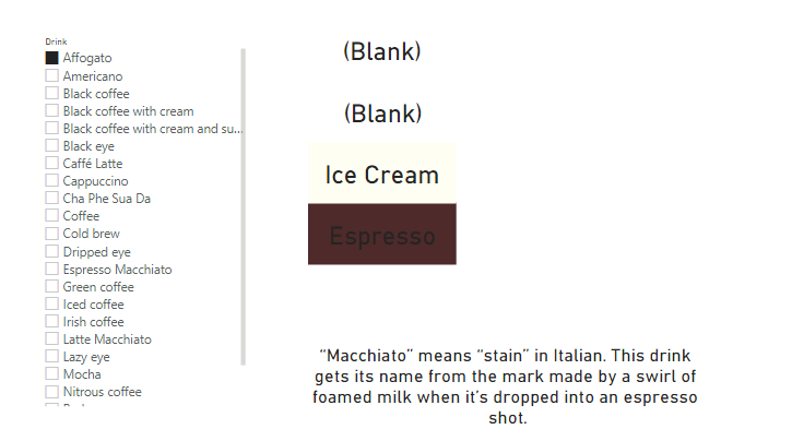
Ingredient 1 =
IF (
CALCULATE ( MAX ( Table2[Value] ), Table2[Ingredient] = "Ingredient 1" )
= BLANK (),
"",
CALCULATE ( MAX ( Table2[Value] ), Table2[Ingredient] = "Ingredient 1" )
)

Step 2 - Coffee cup Visual
I downloaded and installed Pureviz custom visuals as said in the challenge and went through documentation and really liked it. But when I tried to add a custome template to it that I realize that my version of Power Point doesn't allow to create .svg file from slides. I tried few other methods online and no one worked. So I went on and created a simple coffer cup visual using shapes already available to me on Power BI.
The I added some more text boxes and done some formatting to the slicer. Finally the Infographic I created looks like this.

And then I publish it to Power BI service. Here's a video of my infographic in action.
Comments
Post a Comment